Design: one editor for the panels in your 3D scene
Graspable 0.21 brings Design, an editor for the 2D interfaces inside a 3D scene. Every change is written into your code, the agent works on what you select, and one panel can be written for Apple Vision Pro, Unity headsets and Meta Ray-Ban Display.
Graspable 6 min read
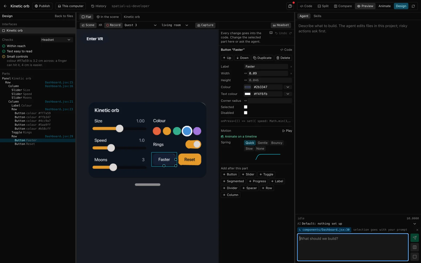
Most of what people do in a headset app, they do on a panel: a menu, a mixer, a settings page, a row of tools. Until now, every change to one in Graspable went through the agent or the code. Design is an editor for those panels. It shows each one flat and straight on, like a screen in an interface builder, and writes every change into the code that places it, so the agent, the 3D view and the headset all see the same interface.
Edit by hand, or ask
Click a part in the flat view or in the list beside it, and the inspector shows what that kind of part has: a button's label, size and colours, a slider's range and step, a panel's padding. Drag the handles on a selected part to size it. Select a row, column or panel, and the space between its parts shows in pink; drag it to change the gap, or drag a panel's edges to change its padding. The preview changes as you drag, and the whole drag is one step to undo.
The selected part also goes with your next message, so "make this bigger" or "add a volume slider under this" is about that part. The agent's changes show in the flat view as it makes them.
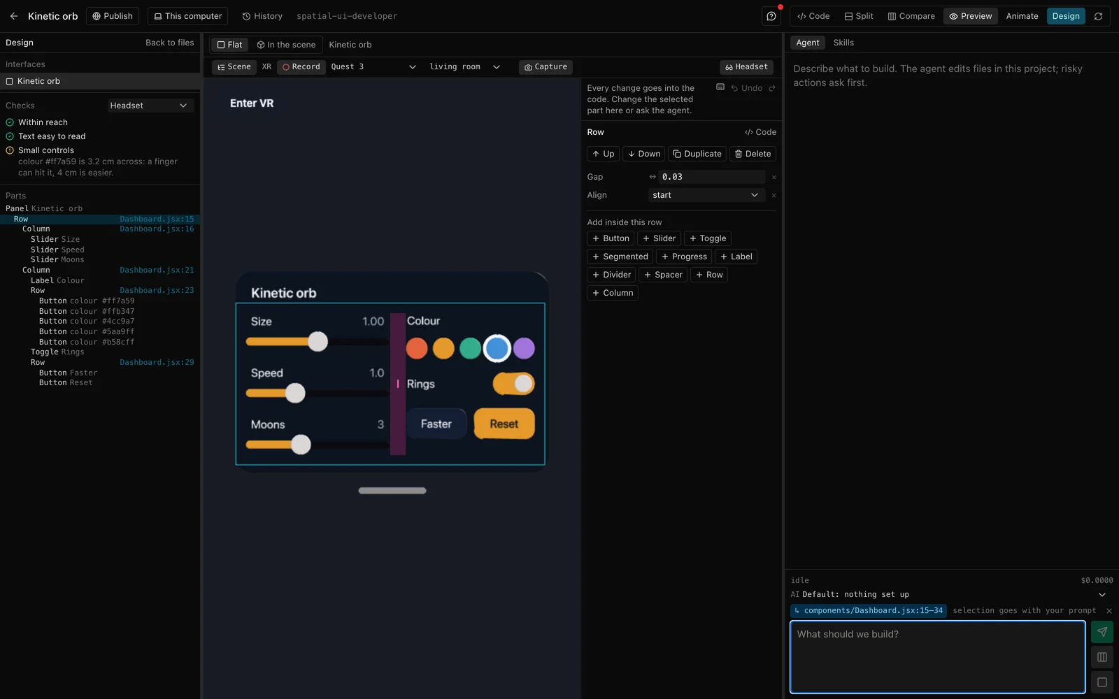
Parts move by drag in the list: onto the edge of another part to go before or after it, onto a row, column or panel to go inside. The keys you expect work too: undo and redo, delete, duplicate, and the arrow keys to move a panel in the room.
Motion with springs
Buttons press in, toggles switch and sliders grow with springs, and a panel comes in with a short movement when it first appears. A spring keeps its speed when its target changes, so a press that is let go half way turns round smoothly instead of jumping.
The Motion section of the inspector picks one of four springs, each set by how long it takes and how much it overshoots: Quick, Gentle, Bouncy and Slow. Its curve is drawn under the choice, and Play shows the part's motion in the preview. Panels choose how they come in: rise, pop or tilt. For movement over time, Animate on a timeline opens the keyframe editor with the part selected, so a panel can slide in during a film.
A theme for every part
With nothing selected, the inspector shows the theme: the colours, spacing and motion every part falls back to. Change the accent colour there and every slider, toggle and button that uses it changes with it. A part's colour can follow a theme colour, or have its own.
Checks for the device
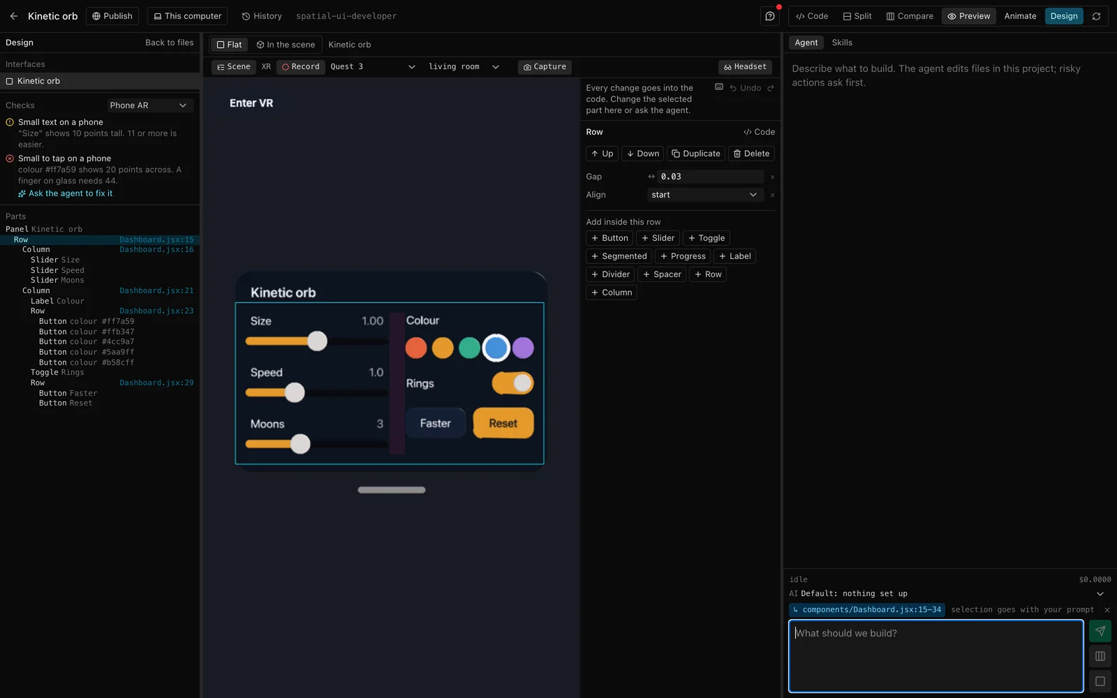
A panel that reads well on a monitor can be too small, too far or too high in a headset. Design's checks measure the panel where it stands, from where a person stands when the session starts:
- In a headset: whether a finger can reach it, whether its smallest letters are large enough for their distance, whether its controls are big enough for a fingertip or for pointing, whether it fits in view, and whether it sits between 10° above and 40° below eye level.
- On a phone in AR: the smallest letters and controls in points on the screen.
Click a check to select the part it is about, or ask the agent to fix it. The request already holds the numbers, such as "make the smallest text 1.4 cm tall".
One panel, several platforms
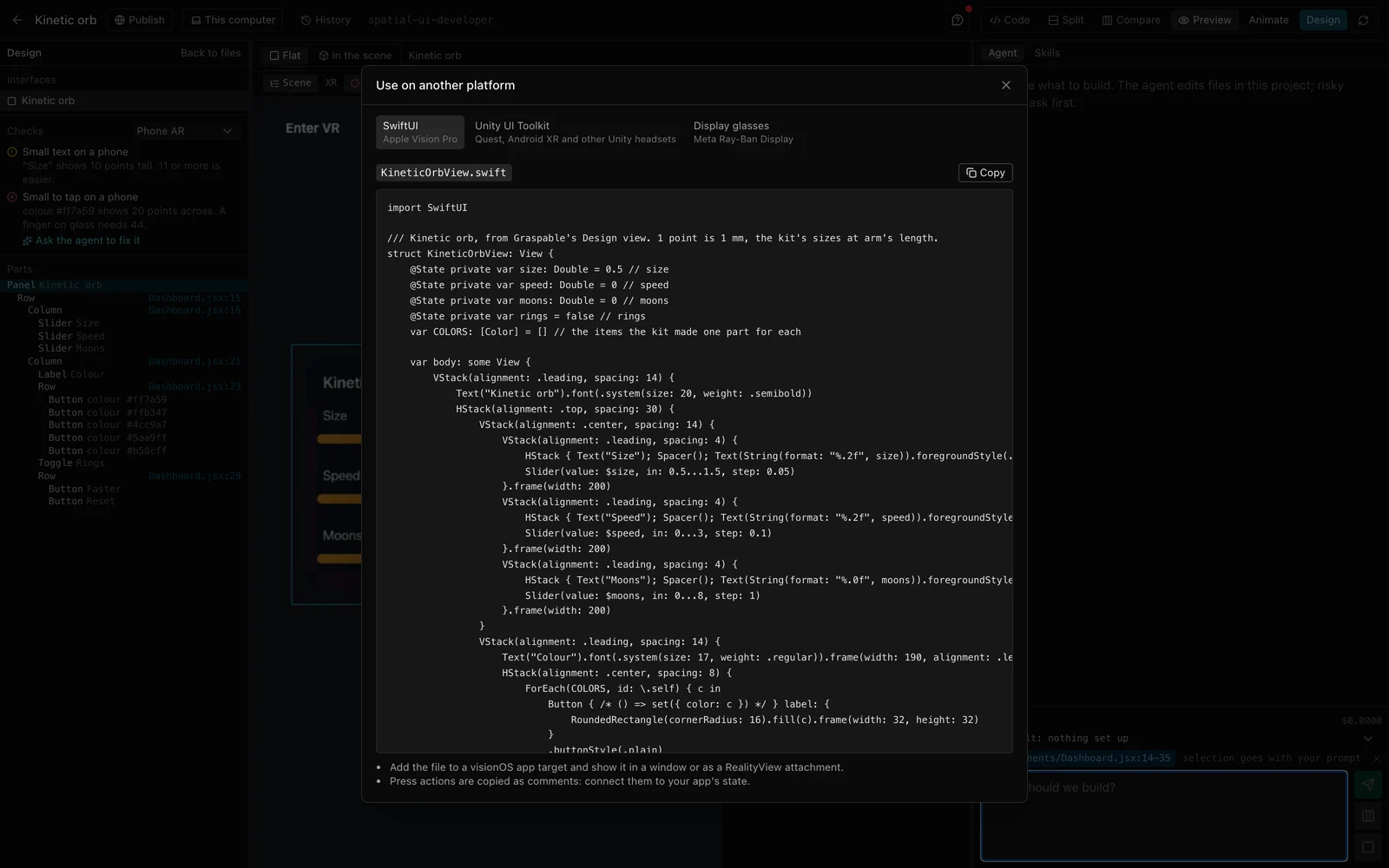
A panel can be written for other platforms from the inspector:
- SwiftUI for Apple Vision Pro: stacks, sliders, toggles, pickers and buttons on a glass background, one point to a millimetre.
- Unity UI Toolkit for Quest, Android XR and other headsets built with Unity: a UXML layout and a style sheet for a world-space panel.
- Display glasses for Meta Ray-Ban Display: a screen built from Meta's Wearables UI toolkit. Glasses have no sliders or switches, so a slider steps with two buttons and a toggle says its state.
Values your code binds, such as a slider's value={volume}, become state of the same name. What a button does is copied as a comment, for you or the agent to connect. We compiled the SwiftUI against the visionOS SDK and the glasses screen against Meta's toolkit before shipping it.
In any web project
Design started with the Hands & Spatial UI template. Other web projects can now add its UI kit: open Design, choose Add the UI kit, and Graspable puts it in a folder of its own and asks the agent for a first panel. Tabletop AR on a phone, React XR scenes, product viewers and games get the same editor.
What it does not do yet
Design edits the parts of the UI kit. A panel built from plain meshes and shapes is still changed in code or by the agent. The checks are rules taken from comfort guidelines and our own measurements of text in WebXR, applied to the sizes in your scene; they are not a test on a device. And the code written for other platforms is a starting point: it places the parts and their values, and leaves the wiring to you or the agent.
Design is in Graspable 0.21. Open a project from the Hands & Spatial UI template, or add the kit to your own, and choose Design in the header.